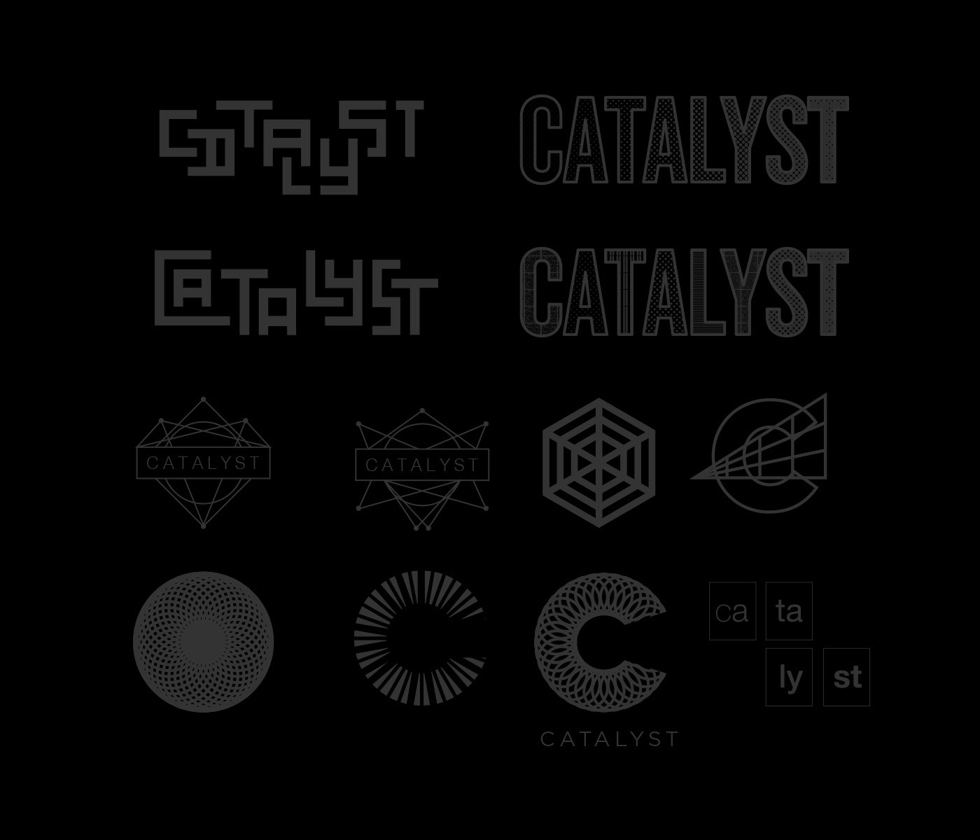
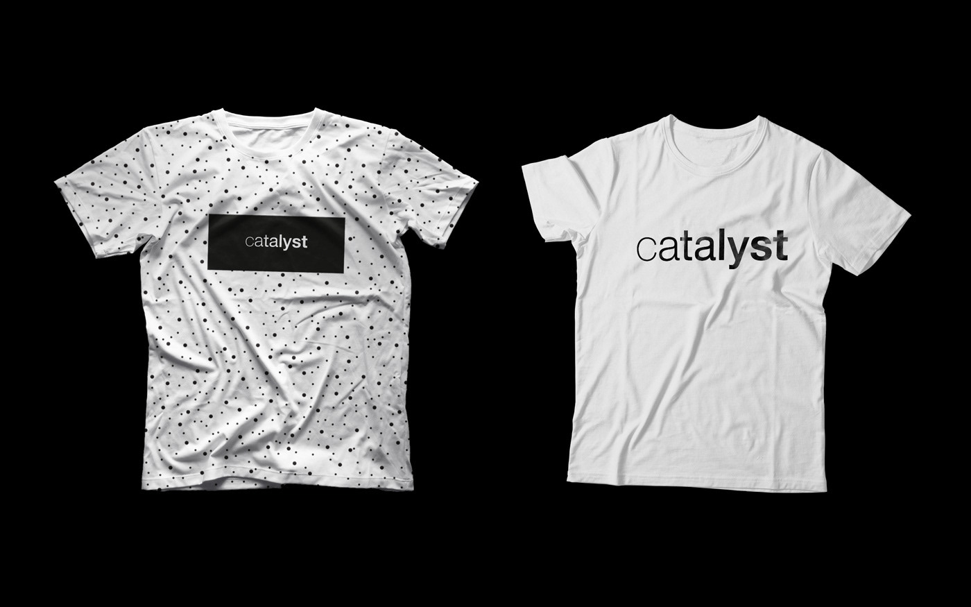
Catalyst is a digital marketing agency. Initially we played around with a couple science related concepts before simplifying the concept and using the font weight to symbolise the change caused by a catalyst. We used Helvetica for the font weight because it has a sterile look commonly associated with science and the periodic table.
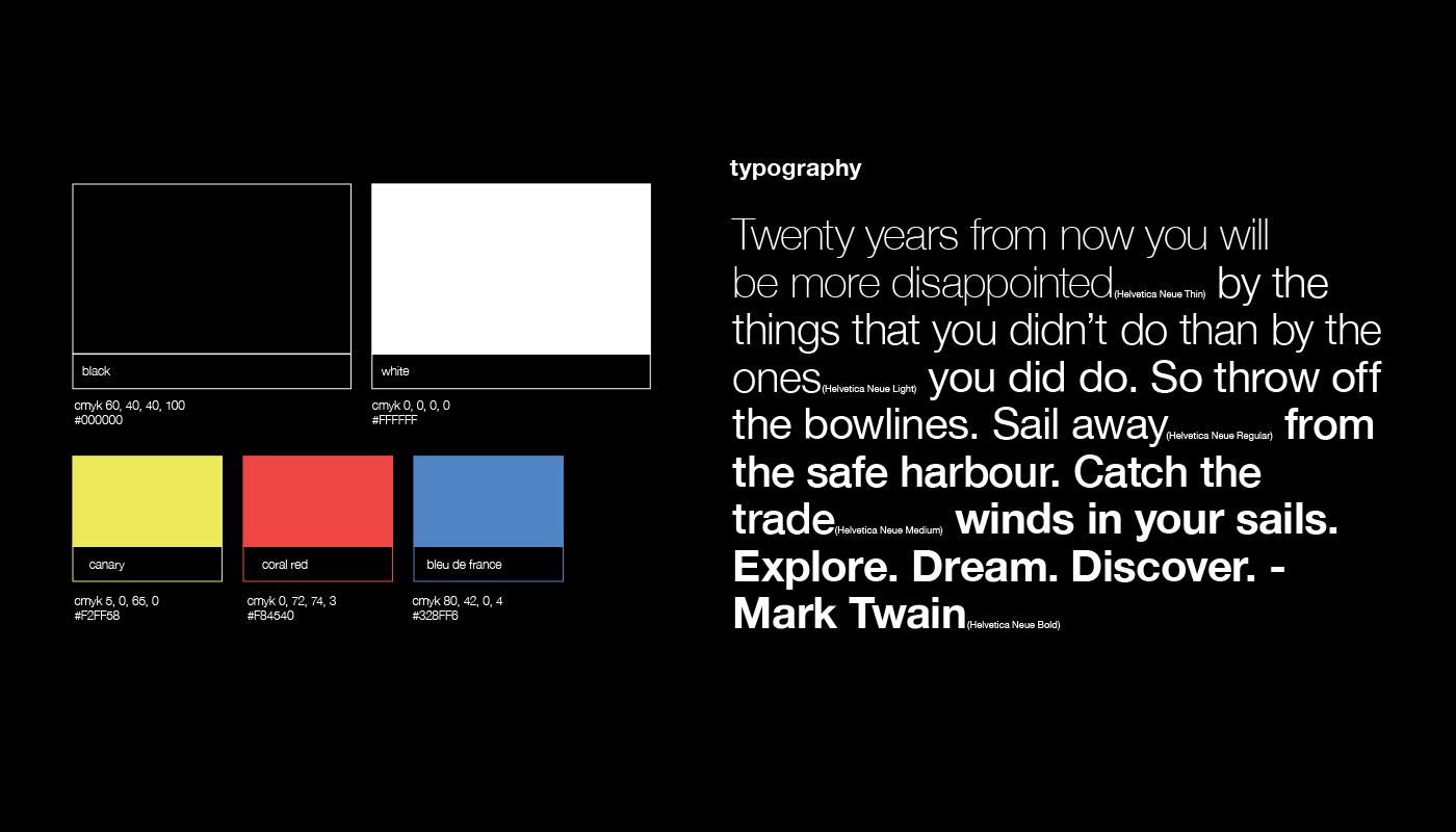
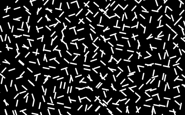
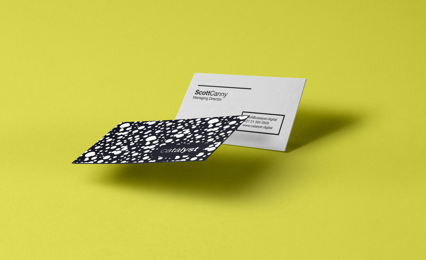
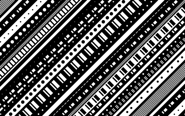
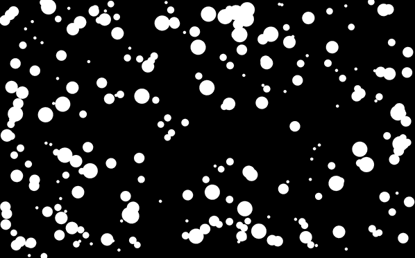
We wanted to avoid using a colourful colour palette and rather playing on the binary nature of something being quite literally black and white in science (of course there are many gray areas in science too). We developed a variety of catalytic patterns in place of colours to gave the brand a unique personality.
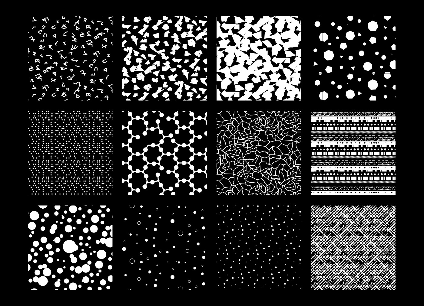
The idea was to have the patterns animated in digital contexts, such as their website, using javascript or css animation.
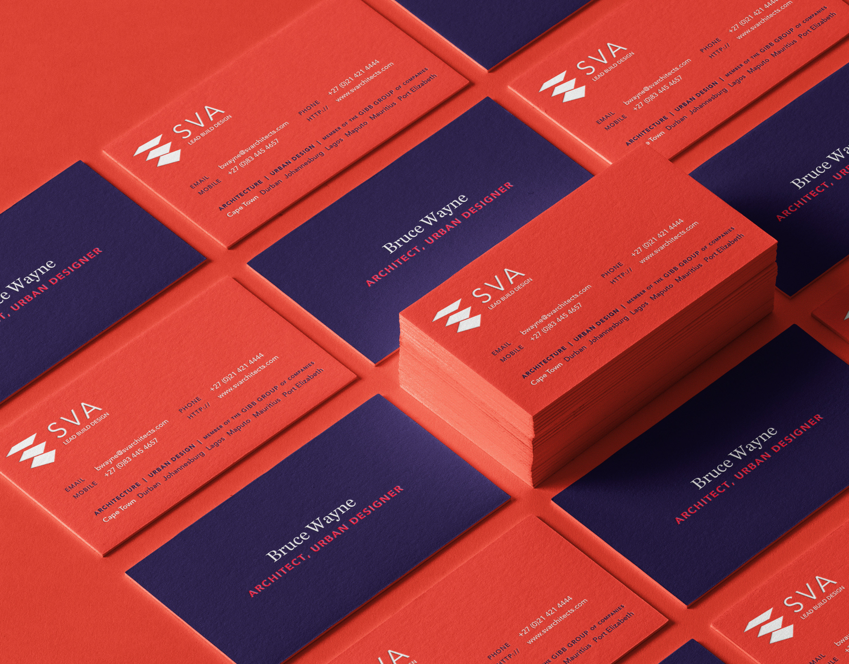
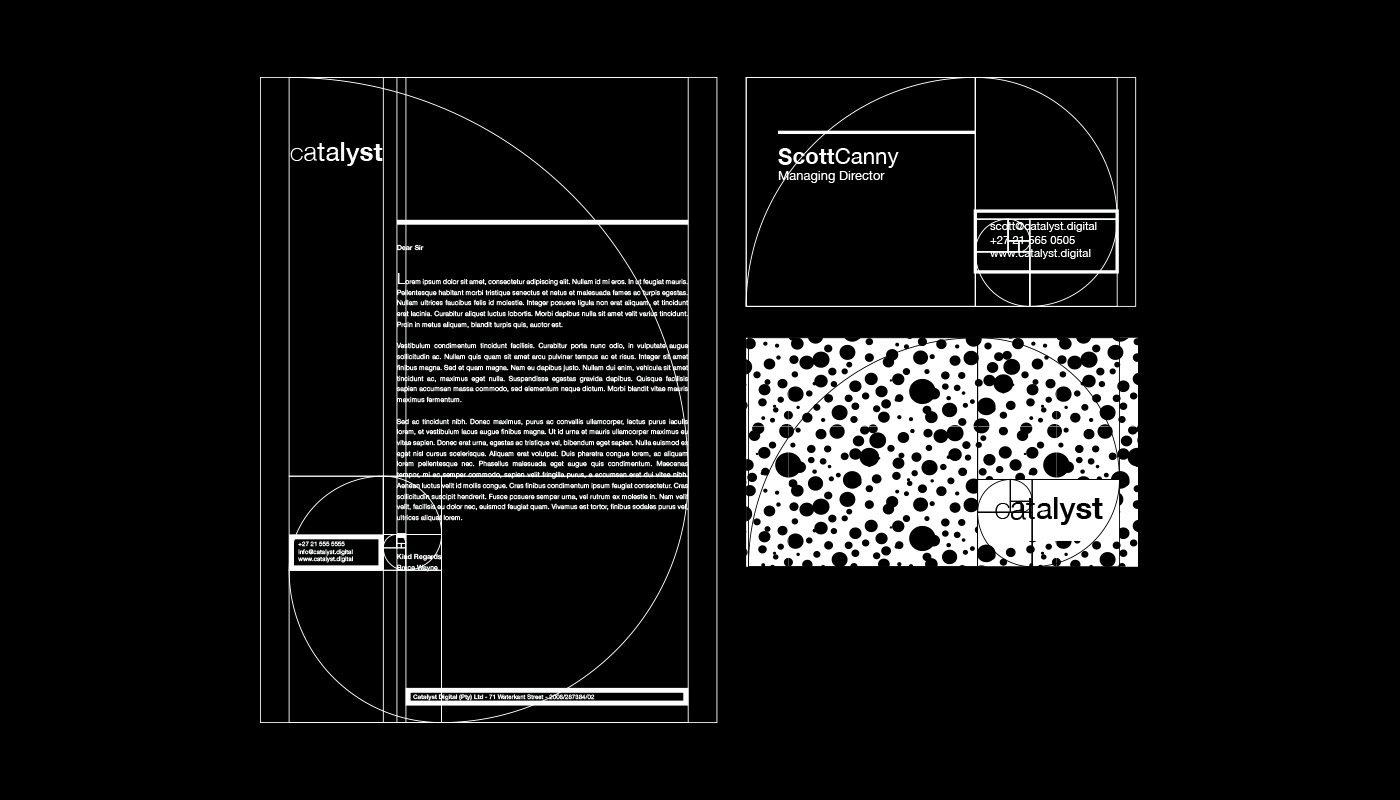
The use of the golden ratio in the stationery may seem a bit excessive or forced but it serves to further reinforce the scientific and analytical nature of the brand

This website was a mockup of how the patterns and identity could be used in a digital environment. The patterns/particles would be moving around or interact with the mouse.

A small selection of the process logos explored along the way