Quicket Rebranding
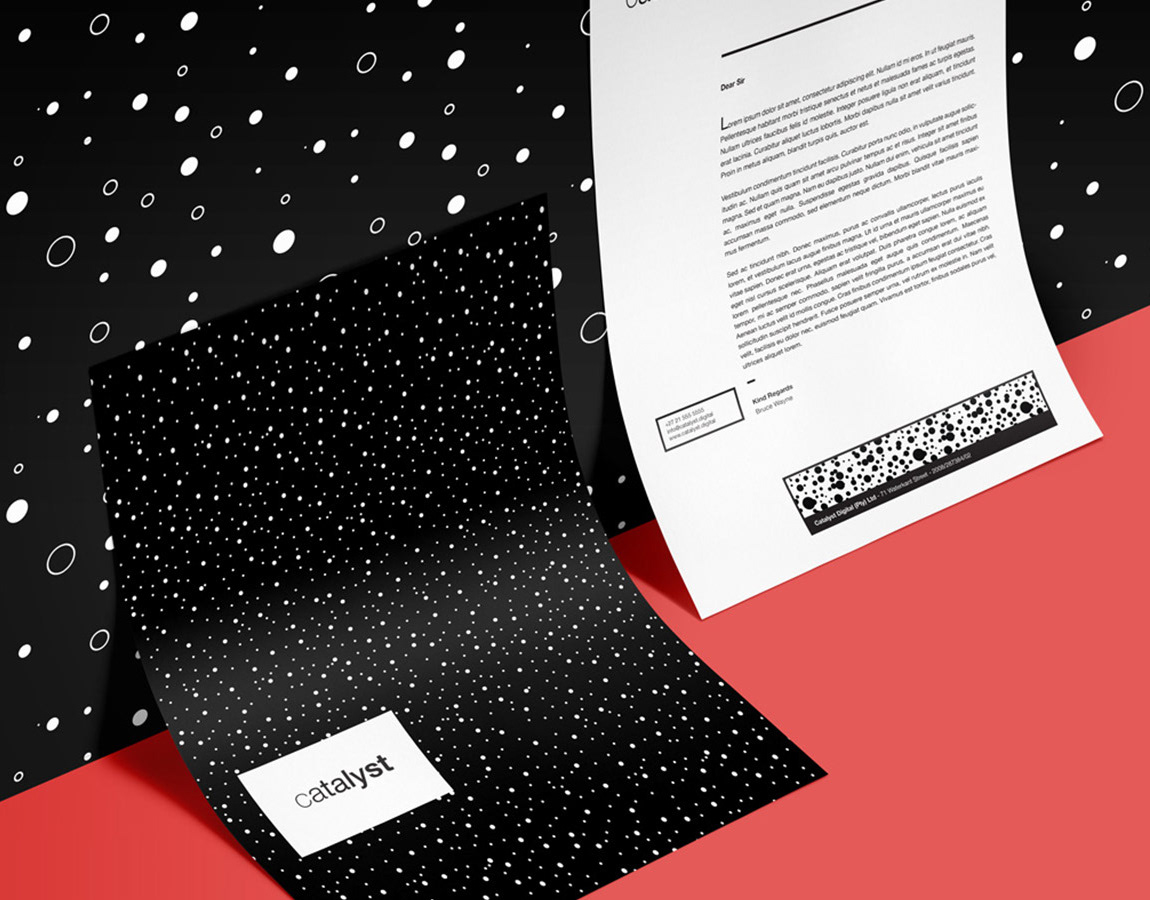
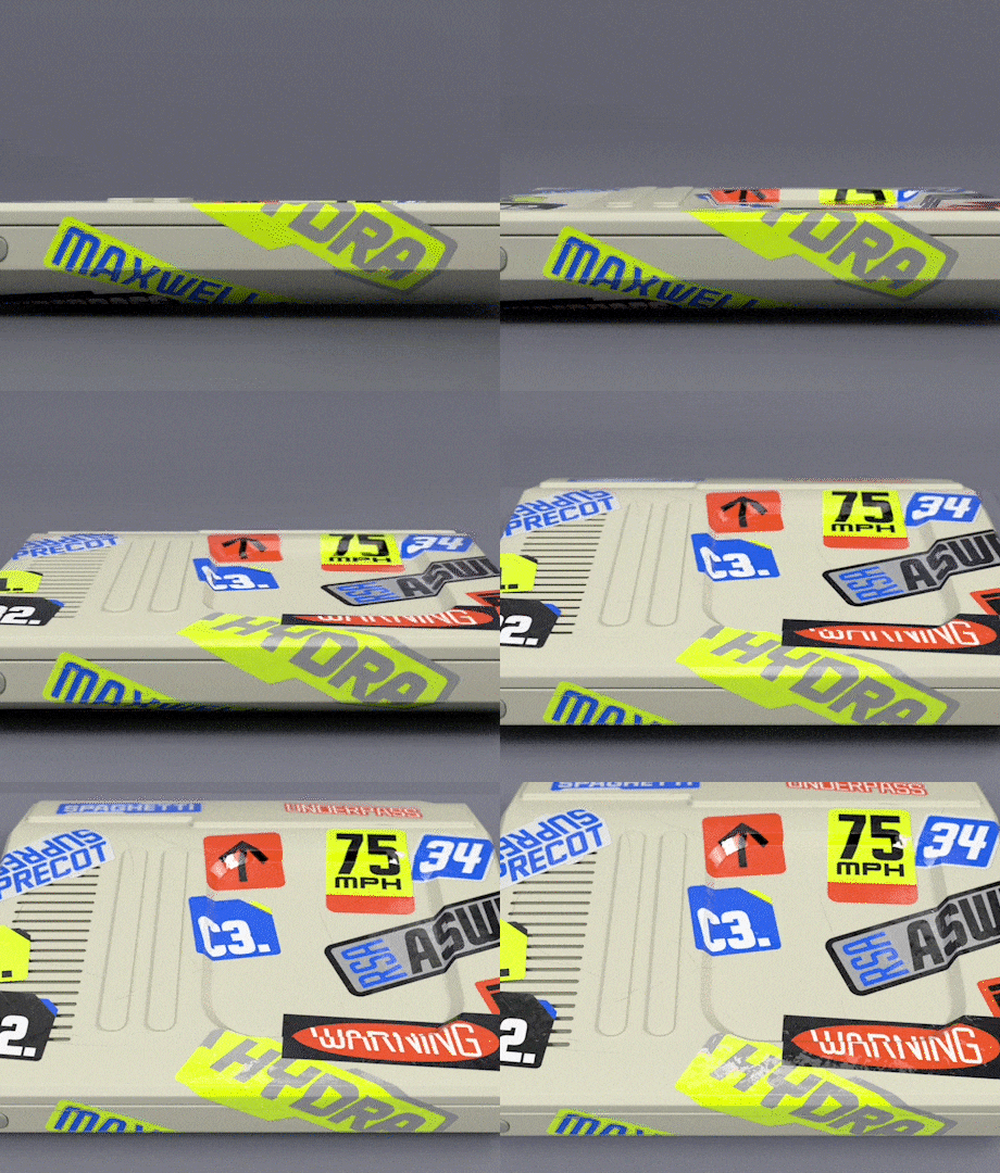
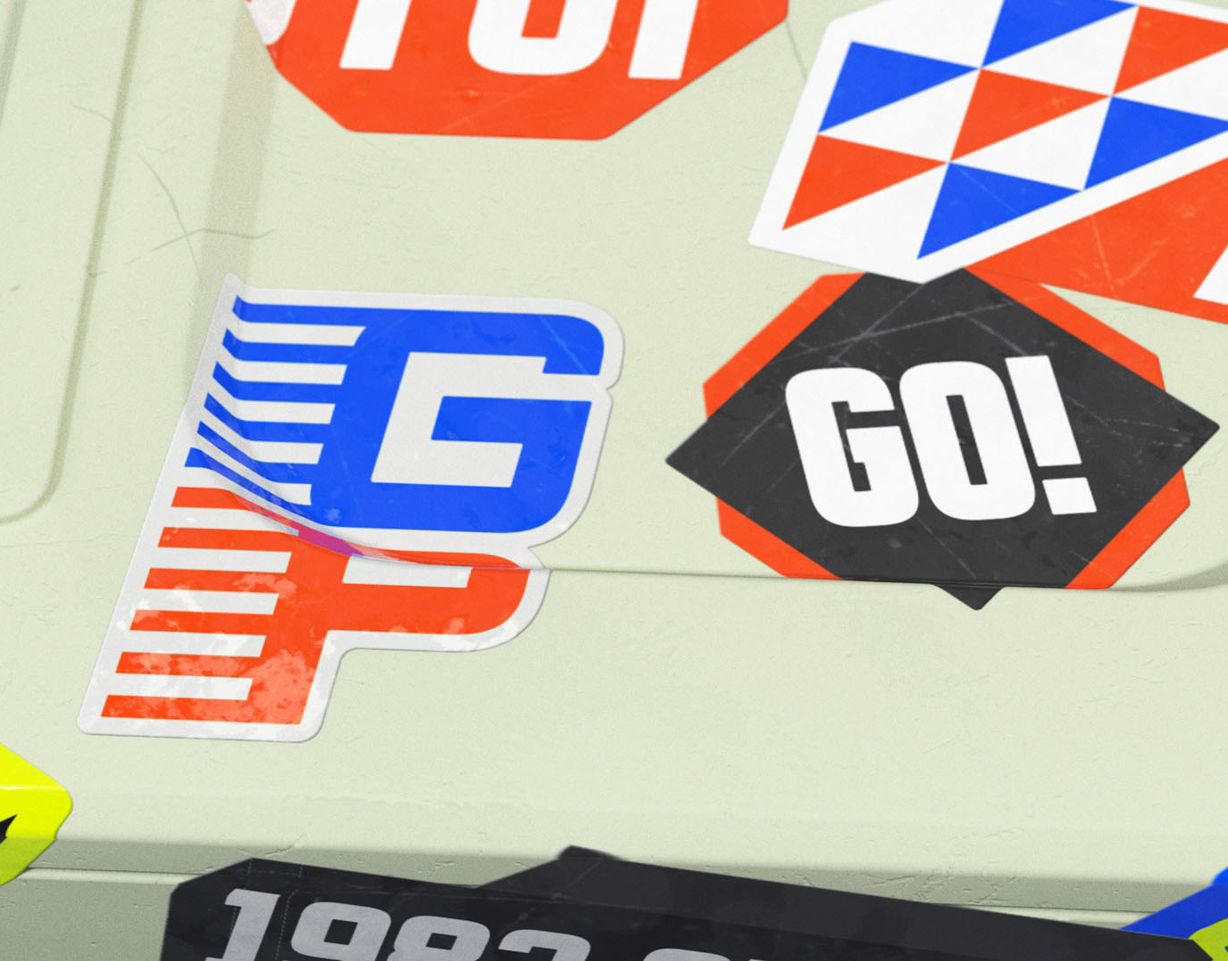
I was tasked with redesigning the Quicket logo at Made Agency. The logo I developed is a simple hand render sans serif with a bespoke Q, using Quicket's recognisable green and orange colour scheme. As a proactive effort I expanded on the original extended identity, which included some basic geometric patterns, to create a much more resolved pattern identity. Additionally I looked at ways to bring animation into the existing pattern designs. I drew a inspiration for the presentation and animation aspects of this project from another Behance project for SMK Universities by Andstudios. so shoutout to them!

